Website Launched in Record Time
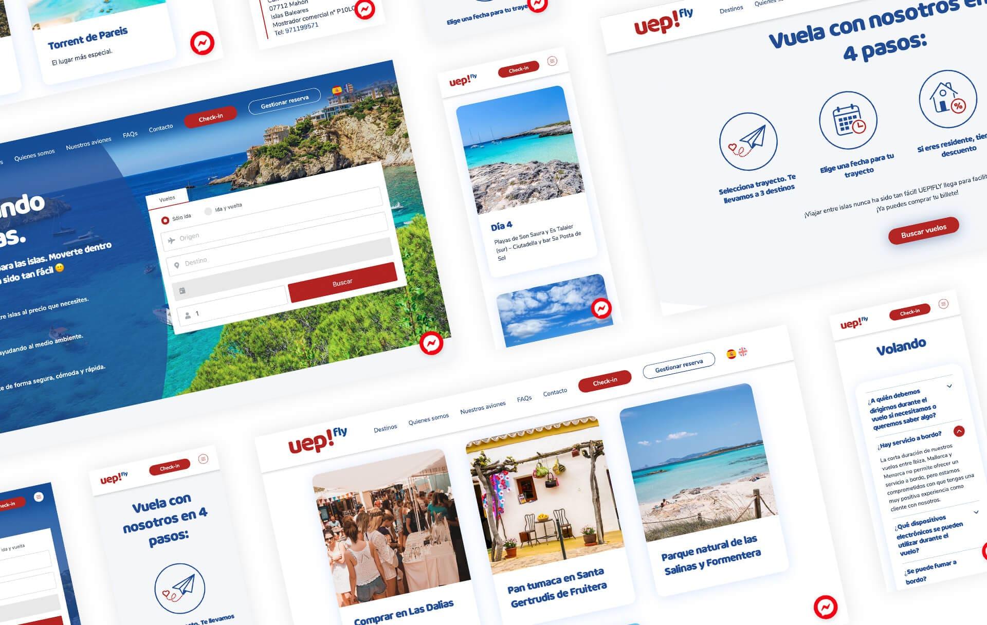
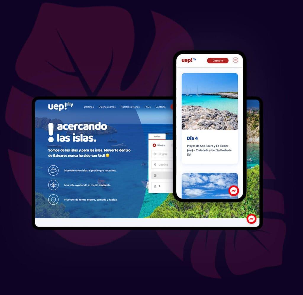
UEPFLY is an airline company founded in the spring of 2021. We were proud to help them launch their official website in record time before the summer season began.
The increase in demand after the COVID lockdowns provided a great opportunity for the company to get off the ground and begin growing.

Agile design agency
for UEP!FLY

About UEPFLY
UEPFLY was born in the spring of 2021 with enthusiasm, dedication and professionalism. But also with the immense experience of Swiftair to the needs and circumstances of the passenger, express parcel and general cargo markets.
The company is focused on connecting the Balearic Islands and its headquarters are in Palma de Mallorca, while the operational base is in Ibiza. Their objective is to increase inter-island travel and in the future reach the Spanish peninsula once its operations have been strengthened.
Project
Details
Services provided
- UX/UI
- Web Design
- Graphic Design
- Website Development
- WordPress Development
- Multilingual Website
- Website Hosting
- Website Maintenance
The Project
We were hired by Efya Digital to design and develop a multilingual website for this newly born airline.
Due to the need to launch the website in a short time frame to take advantage of the summer season and holiday demand post COVID lockdowns, we had to work incredibly hard to get it done on time.
One of the key elements was choosing a content management system (CMS) that was flexible and easy to use. A CMS that is too rigid can make it difficult to make changes or updates to the site, while a CMS that is too complex can be overwhelming for both the website owner and visitors.
The solution was to create a custom website using the WordPress content management system (CMS) and give the client the ability to easily update their website content without compromising the user experience.
The result is a website that is easy to use and easy to update, making it the perfect solution for the client.
Thanks to our hard work and dedication, the website was launched on time ahead of the high traveling season, allowing Uepfly to benefit from it.
Mobile UX as a priority
for accessibility, speed, and clarity
The Challenge
The challenge of this project was to reflect the company’s enthusiastic spirit and bring its visual characteristics to a new level.
The website needed to be multilingual, mobile friendly and accessible.
And we had to get all this done within a very tight deadline!
Streamlined site design
Although UEPFLY is a new airline, it already had some predefined assets that needed to be reworked and extended to be better applicable in a web environment.
One of these assets was the logo, which dictated the use of the Quentin pro font on the website. While adhering to important UX rules, we made the most of this constraint to create a visually appealing and user-friendly website with plenty of white space, making the new site much more accessible and easier to navigate.
Mobile first
As more and more people are using their phones as their primary internet source, it was essential that the UEPFLY website had a good mobile UX. Our priority was to make the website easily accessible, quick, and clear.
Flexible content
It was important that the site be able to accommodate different mixes of content across the pages of the website.
We also needed to be able to have the different language versions of the site using different content, so we built the website pages using flexible content blocks. This allowed us to have different levels of information for each language version.
We know that first impressions are important, which is why we worked hard to create a beautiful website that our client could be proud of.