The 4 Steps To Designing An Amazing Marketing Email
What do the best-designed marketing emails have in common? They’re simple, evocative, and readers don’t have to work hard to find the value.
With a strongly-designed email, you’ll clearly communicate your message and create a consistent experience that guides your contacts through every step of the funnel.
With our comprehensive article, we answer your tough questions of how to produce quality content through compelling design.
The basics of email design
While your design may change over time, 4 steps remain the same in any outline creation:
1. Set a goal
Always start with the goal (purpose) of your email, which isn’t just for bigger clicks and open rates. The initial purpose of every email is to engage contacts in a conversation while building trust and providing clear value.
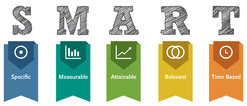
A SMART (Specific, Measurable, Attainable, Relevant and Timely) goal might be increasing client testimonials on your website by 20% within the next 3 months. Maybe you’re hoping to increase the number of active customers by 30% over the next month.

Once you’ve clearly outlined a goal that should spark a conversation and provide value to them, you can proceed with the second step.
2. Outline your email design
During this step, you write and design the content of your email. The content of your marketing email is your chance to relay to the reader the value they can get, the action they should take and most of all – create a conversation that feels natural to them.
When outlining the way you’d like to structure your content, keep in mind the fundamentals of writing a compelling copy:
Write for ‘scannability’
It’s crucial to make a particular body of text easily read and understood by the target reader. Readers should be able to quickly scan through each email and notice the main points without getting lost or bored.
Provide visual clues
Guide the reader through your content by using bold text, headers, shorter paragraphs, bullet points, and even numbered lists.
Leave plenty of white space around the different elements (especially your CTA to avoid high-density walls of text, which can be especially difficult to read.
Personalize when appropriate
Customers respond better to human connections, so always try to add a personal touch to your marketing emails. Using the first name of your contact is an absolute requirement, but don’t stop there.
You can use any relevant contact property you have (e.g. company name, location, date of their last visit on your website, a previously attended event). Always make sure you have a fallback, in case the information for a particular user is unknown.
Proofread copy
You might spend a great deal of time creating a great template with an excellent layout – if you have typos and glaring omissions in your marketing emails, you’ll lose face with your clients.
There are countless free online tools to use (like Grammarly and Typely) that check for errors, strange phrasing, and punctuation.
What does the email marketing process look like?
Start by creating a simple outline of your email’s content. Consider the first thing you’d like the reader’s attention to be brought to.
The top of your marketing email should be thoughtful as this is the first content your prospective customers will see.
- Utilize your logo, so the people know who they are engaging with.
- Add your contact’s first name as a personalization token, which is a small custom variable (like *|FNAME|* in Mailchimp) that can be added to all marketing emails. For better understanding, check the most common email service providers tokens and use our free email personalization tool as a quick reference.
- Write some copy, making sure to add visual clues (e.g. headers, bold font) to make the copy as scannable as possible.
- Ensure that your CTA button is clearly outlined and includes an actionable step for customers (e.g. “Get started”, “Click here”)
An email outline in action
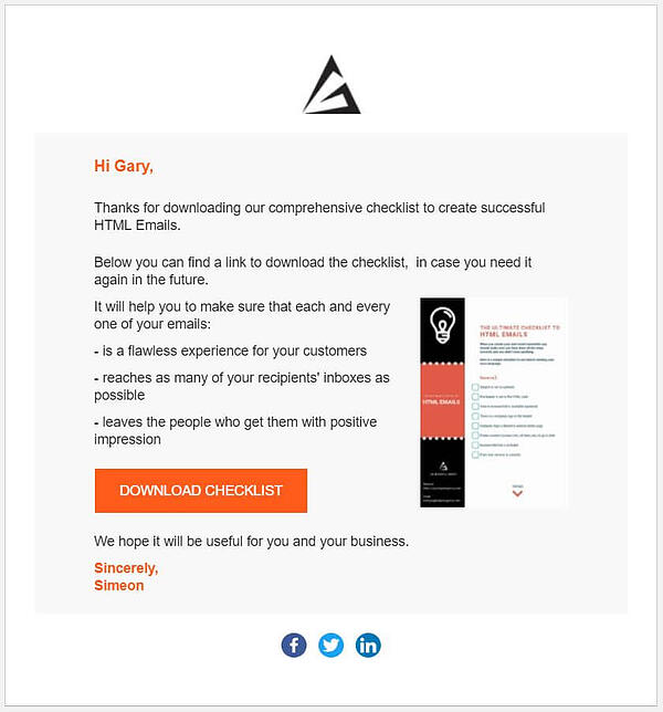
Below is an email template that includes Agile Digital Marketing’s logo, personalization, effective copy, and a CTA:

Providing a structure like this means simple replication for multiple emails. Once you are done with a basic, simple sketch like this, you’re ready for the next step.
3. Create a consistent experience
Creating a consistent experience can be broken down into two parts: your brand as well as email clients and devices.
No one does your brand better than you
With your brand you want to create a consistent experience through all the channels you use to communicate with your contacts.
The look and feel should stay consistent, although each conversation will be tailored to the platform and the subject might be different.
This includes the logo, the colors, even the language you use to address the people who visit your website. It can be the small things that really make a lasting impact on your contacts.
Mobile and site responsiveness is key
Various device types and email clients (e.g. Gmail, Outlook) will change the way your marketing email looks. Desktop, mobile and web email clients will further render your emails differently.
That’s why it’s vital to test your emails before sending them.
To provide the most consistent and valuable experience across different email clients and devices, always provide a link for recipients to view the email browser version. Web browsers are much more forgiving than email clients and will give your reader the experience you are looking to provide.
Design your marketing email to ensure that the viewer has the best possible experience, no matter how they’re accessing it.
Think about your phone screen versus your computer. It may have been the norm to create marketing emails with a 600 px width, but screens are constantly changing.
Solve this issue by making the layout responsive to the width of the screen, and always use a mobile-friendly template.


Mobile responsiveness is crucial for marketing emails.
Design your email to ensure the person who receives it has the best possible experience, no matter where they view it. This will help you maintain the consistency you are striving for.
By combining these two elements of consistency, you will be able to provide a better experience that will build trust with your audience.
For more insights on creating a consistent user experience, you can also check out our article on how to Avoid Common Web Design Mistakes for Exceptional User Experience.
4. Bring IT ALL together
When you’re ready to hit “Send”, you’ll need to pay extra attention to the call to action (CTA) button. Your email’s set goal will be tied directly to this button, so you’ll want to be as clear and actionable as possible.
Without clarity, how will prospective customers know what the next step is? The CTA must be substantial, include an action verb, and needs to be designed with enough blank space around it to attract the reader’s eye.
Once you have your CTA designed and added to emails, you’ll have an email that inspires conversations and provides value to your contacts.
Let Agile help you manage your email marketing campaigns
Following the steps outlined above will help you design an email that inspires conversations and provide value to your contacts.
As a Leading London Email Marketing Agency we’re happy to assist you with any of the above steps (whether that’s design, email coding or management of your email marketing campaigns) – or all of the above.
I am a managing partner at Agile Digital. A graduate of Modern Balkan history, I made a complete pivot in my career when, together with Juan Pineda, we founded a nearshore design and development studio Sofyma in 2009, followed by our digital agency Agile several years later. Over time, I have worked on hundreds of digital projects from small startups to global brands. I enjoy writing in our Blog about topics I am actively involved in at work.
Related
Articles


